
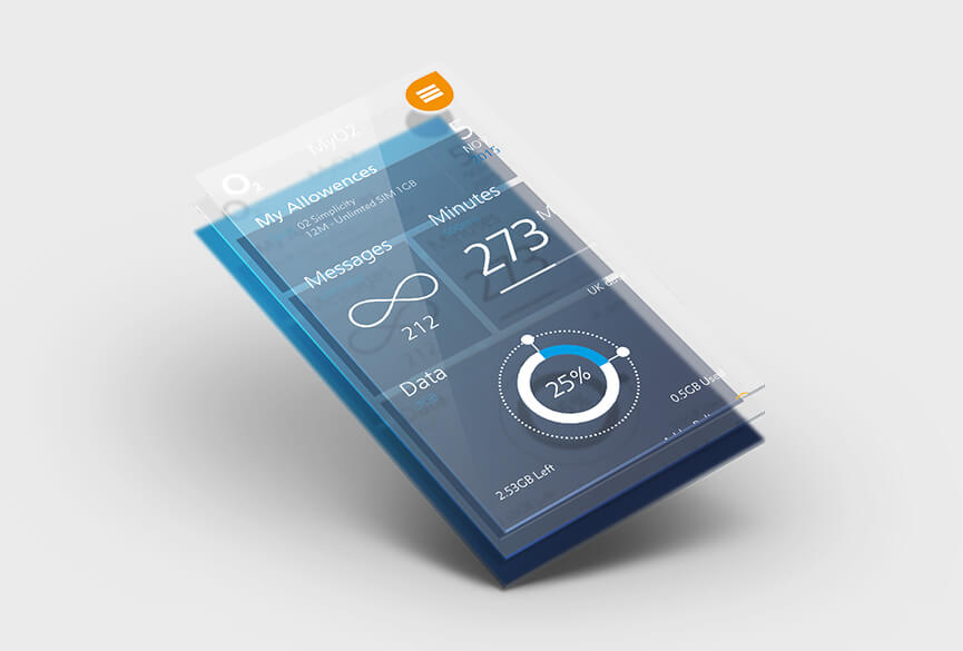
The new menu architecture reduced the required clicks by 50% on the most common performed tasks. The structure also clustered relevant information together in a visually engaging manner which stayed true to the brand guidelines.
Improve the UX of the 02 app
This practice brief was to explore the ways in which an existing app (2015 version) with basic features could improve for the user. The design was prominently a list of hyperlinks directing users to account information and usage breakdowns.
- UX
- App design
- Client02 (practice)
- Year2015