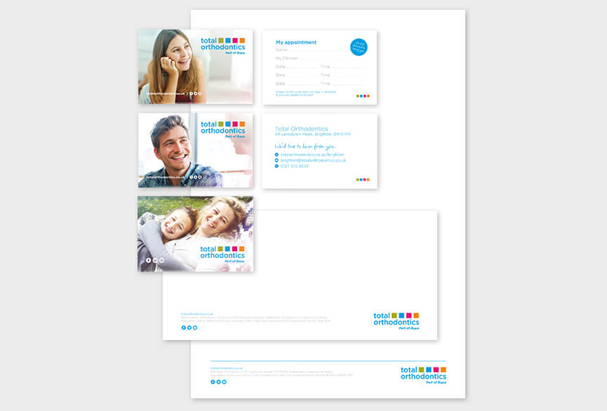
Stationary
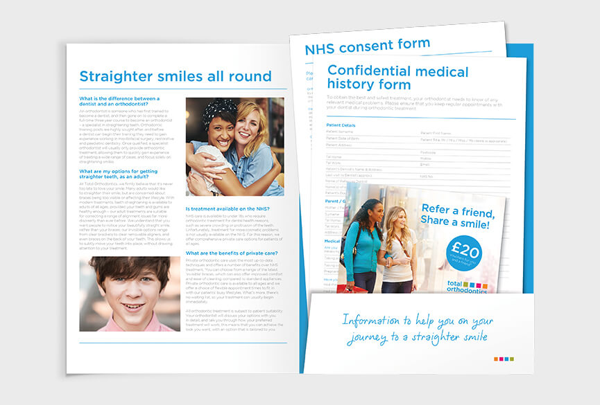
Forms and folders
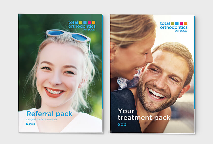
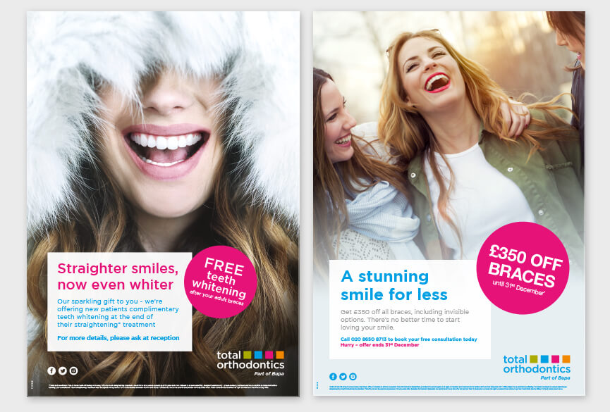
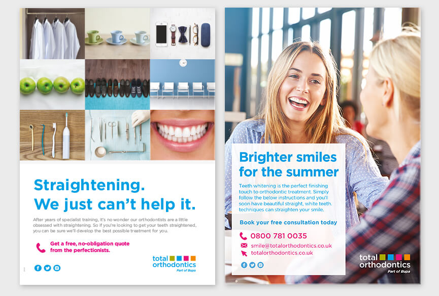
After undergoing a transformative teeth straightening treatment, individuals can't wait to flaunt their new smiles to friends and family. Capturing this energy was important for the brand. Our approach involved utilising naturally-lit soft-focus photography in vibrant social settings. Full-bleed images were complemented by clean simple layouts, bold colors, and jargon-free content. The new brand is modern, fresh and lively that resonated with our target audience which were a mix of teenages and young professional adults wanting to create an impression.
Posters
Design automation
New designs were uploaded into a cloud-based system, where orthodontic dental practices could order material and the practices' details would automatically populate into the design. This level of automation required a robust design structure to successfully handle a variety of different amount of content being populated by the practices. Needless to say the new design worked beautifully, improving the efficiency of the process.
Update the brand to be more relevant to patients
With over 41 orthodontic dental practices in the UK, Total Orthodontics wanted to maximise the potential by updating their brand identity. Existing branding was off-audience, dated, rigid and restrictive on digital platforms.
The primary reason for most orthodontics treatment is not functional but social standards.
- Branding
- Graphics design
- ClientTotal Orthodontics
- Year2018